
This article is an excerpt from the Shortform book guide to "Naked Statistics" by Charles Wheelan. Shortform has the world's best summaries and analyses of books you should be reading.
Like this article? Sign up for a free trial here .
What is the normal distribution in statistics? How do measures of central tendency relate to the normal distribution?
The normal distribution is a foundational concept in statistics. When data is normally distributed, it means that most values cluster around the center. Therefore, the mean, median, and mode are exactly the same in a normally distributed data set.
Keep reading for the theory of normal distribution, explained in simple terms.
Normal Distribution
A normal distribution refers to a dataset that forms a perfectly symmetrical bell curve around the mean when graphed as a frequency distribution (a visual representation of data where the height of the bars represents the number of times a specific outcome occurs).
(Note that the mean and the median will be the same in a perfectly symmetrical distribution.)
When a dataset looks the same on either side of the mean, we say it’s symmetrical. Symmetrical distributions feel intuitively familiar because, as Wheelan explains, they happen in real life all the time. For example, most babies start to crawl somewhere between six and 12 months, with an average of around nine months. Some will crawl earlier than six months, and some will crawl after 12 months, but the peak of our frequency distribution will be at nine, and the frequency of crawlers will taper off symmetrically in either direction.
Normal distributions are particularly useful because they allow us to know what percent of our data lies within a certain distance (measured in standard deviations) of the mean without doing any calculations.
Skewness
When data isn’t normally distributed, we often say that it’s “skewed to the left” or “skewed to the right.” Wheelan introduces this concept but doesn’t provide a full explanation of what being skewed left or right means. Since this terminology is common in statistics, and the concept can be tricky, we’ll cover it here.
Data that are skewed to the right have a longer “tail” to the right of the peak of the curve. In other words, there are a few values in the dataset that are much larger than the others. These larger values make the mean larger than the median. This is also called a positive skew because it skews the mean in the positive direction. An example of positive skew could be a few outstanding students inflating the class average on a difficult test.
Data that is skewed to the left has a longer “tail” to the left of the peak of the bell curve. In other words, there are a few values in the dataset that are much smaller than the others. These smaller values make the mean smaller than the median. This is also called a negative skew because it skews the mean in the negative direction. An example of negative skew could be a few students who skipped class, bringing down the class average of an easy test.
Standard Deviation
We can describe how “spread out” a dataset is around its mean by using a descriptive statistic called the “standard deviation.” Once we know the standard deviation, we can make statements like “Value X is one standard deviation above the mean” or “Value Y is two standard deviations below the mean.”
Wheelan explains that the standard deviation will be relatively small when data clusters tightly around the mean and relatively large when the data is spread out.
In the image below, Dataset One has a smaller standard deviation than Dataset Two.
We can often intuit which of two datasets is likely to have a larger standard deviation than the other. For example, say we have two hypothetical datasets: Dataset One is a collection of the average typing speed, in words per minute, of 100 professional typists. Dataset Two is a collection of the average typing speed, in words per minute, of 100 randomly selected people at the local library.
We can reasonably guess that Dataset One will have a smaller standard deviation than Dataset Two because we know that professional typists all type fast. Therefore, most of the values in Dataset One likely cluster around a similar fast typing average (the mean). In contrast, we’re likely to find a mix of slow and fast typists at the local library, meaning the values in Dataset Two will be more spread out.
Normal Distribution Proportions
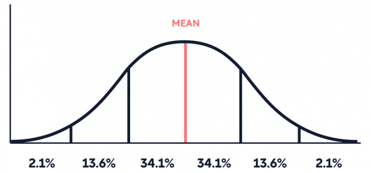
As mentioned above, normal distributions are particularly useful because we automatically know (without doing any calculations) what percent of the data lies within one, two, three, (and beyond) standard deviations of the mean. In a normal distribution, shown below, the bulk of the data (68.2%) falls within one standard deviation above and below the mean, 95.4% of the data points fall within two standard deviations above and below the mean, and 99.7% fall within three standard deviations. Each dataset has its own standard deviation, but these percentages remain the same whether the standard deviation value for a given dataset is one, 50, or 500.
(Note: In a normal distribution, 34.1% of the data falls within one standard deviation above the mean, and 34.1% falls within one standard deviation below the mean, for a total of 68.2%.)
Wheelan explains that, in general, when a value lies within one standard deviation of the mean (in either direction), we say that it’s relatively similar to the average. Once a data point is more than two standard deviations from the mean, we can see that it’s larger or smaller than roughly 95% of the other values in the dataset, making it relatively dissimilar to the mean.
We’ll highlight these concepts with an example of how standard deviations and the normal distribution can help us orient ourselves in a dataset:
Say you start working toward a karate black belt. One year into your training, you earn the yellow belt: the first belt of the process. You proudly ask the sensei how long it takes the average person to reach this milestone. He tells you that the timing is normally distributed and that it takes people an average of three months with a standard deviation of three months. You humbly realize that you are three standard deviations above the mean at twelve months of training, meaning that 99.7% of the other students at the gym earned their yellow belts faster than you.
Now, say that, undaunted by your relatively slow progress toward your yellow belt, you stick with your training. Eleven years later, you earn your black belt. When you ask your sensei how long it takes the average student at the gym to reach this level, he tells you that the average time is ten years, with a standard deviation of six years. You feel proud! You have met your goal, and your timeframe falls well within one standard deviation of the mean, meaning that your time was pretty average.
This example highlights how the size of the standard deviation adds context to a dataset. Since most people earned their yellow belt within a relatively narrow timeframe (smaller standard deviation), we might infer that the skills necessary to reach that level are reasonably straightforward. In contrast, the timeframe to earn a blackbelt was widely distributed (larger standard deviation), suggesting that the achievement requires enough skill and dedication to separate students by several years.
| The Limitations of Normal Distribution Explained The normal distribution is a theoretical model for how data tends to arrange itself in the real world. While many natural phenomena take on a close-to-normal distribution, virtually nothing that we can collect data on will be perfectly symmetrical. Therefore, researchers and statisticians use the normal distribution, knowing it’s an effective yet imperfect tool because it relies, in part, on theory. The ability to analyze data with technology has the potential to change our relationship with the normal distribution. Modern researchers can let computers generate their own models that perfectly fit the dataset they’re analyzing. These are called data-driven models since they rely solely on data rather than data and theory. There are advantages to both data-driven and theory-driven models. Data-driven models are more precise when making predictions because the equations they generate are based entirely on the dataset of interest and not a theoretical curve. However, data-driven models are susceptible to being statistically accurate but not representative of the real world if the data used to generate the predictive equations are biased. Theory-driven models are useful because they help ground our understanding of the underlying phenomena behind the data. An algorithm generated by a computer can seem abstract, whereas equations and conclusions drawn from a normal curve, for instance, can be easier to conceptualize. For example, as we see in this guide, the normal distribution is central to learning statistical concepts. As noted above, the normal curve is also particularly useful because of the predictable standard deviations in a normally distributed dataset. Data-driven and theory-driven models can coexist and inform each other. For example, data-driven models can become theory-driven models over time, and a data-driven model can be used to predict, while a theory-driven model can be used to explain the same phenomenon. |

———End of Preview———
Like what you just read? Read the rest of the world's best book summary and analysis of Charles Wheelan's "Naked Statistics" at Shortform .
Here's what you'll find in our full Naked Statistics summary :
- An explanation and breakdown of statistics into digestible terms
- How statistics can inform collective decision-making
- Why learning statistics is an exercise in self-empowerment


